The Minard Map
Charles Minard’s map representing Napoleon’s Russian Campaign is an iconic example of early data visualization. Long heralded as one of the best examples of data visualization, it is remarkably able to show six different pieces of information, including geography, the number of men remaining, and temperature, in one unified visual.
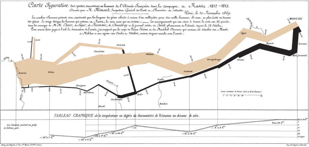
While this map is able to show a lot of information about the Campaign, many researchers have created their own versions of it in an effort to improve this one. These include annotated versions and coded ones. The annotated version of this map does add important information, but I feel as though it loses an element of the visual appeal of Minard’s original map. This, in my opinion, failed attempt to improve it, points to Minard’s expertise when creating his map. The amount of information that the visual shows is extremely impressive. On the other hand, the coded version of the map does seem to add a lot of value to it. Initially, the viewer needs to read about the map to fully understand everything that it tells us. The coded version of this is able to highlight the same important information, without the viewer needing to read additional information about it and without making it feel more cluttered.
One thing that I would change about this map is how the temperature is recorded. Minard’s goal was to show how it became colder and colder over the course of the campaign. Unfortunately, to do this, the viewer must read from right to left, which feels counter intuitive. If I were to change this map, I would want to find a way to record the change in temperature from left to right, or at least add arrows to signal that it should be observed from right to left (same with the black retreat path).
General Reflection on Data Viz in DH
One of the hallmarks and assets that digital humanities offers is the ability to take full advantage of the visual field to present important information. Because of this highly visual component of the subject, researchers need to make sure the visuals they are employing are both effective and accurate. Even if a DH project has a goal or mission, creators need to make sure they are not actively trying to mislead viewers. If a viewer notices visuals that are attempting to be tricky, this can call in to question the whole ethos of the project. Additionally, making sure that your graphics are capturing the viewers attention is important, especially if it is something you are putting significant time and resources into. This can include being mindful of color choices, font size and type, and the axes of graphs.
1 thought on “Analyzing the Minard Map as a form of Data Visualization”
Comments are closed.
I strongly agree with your points about the right to left aspects of the visual, those made it much harder to digest on first glance (arrows would really help, and wouldn’t detract much from the visual as a whole). I also like your point about how the coded version does a better job of directing the viewers attention at the important parts of the visual, making it easier to understand.