Is Minard’s Map the Best Statistical Graphic?
I found Lin’s presentation in class regarding data visualization really interesting as well as topical
I found Lin’s presentation in class regarding data visualization really interesting as well as topical
I think the key take away from Lin’s presentation is that good data visualization should
With space for much potential in data visualization, there is also the risk in overwhelming viewers
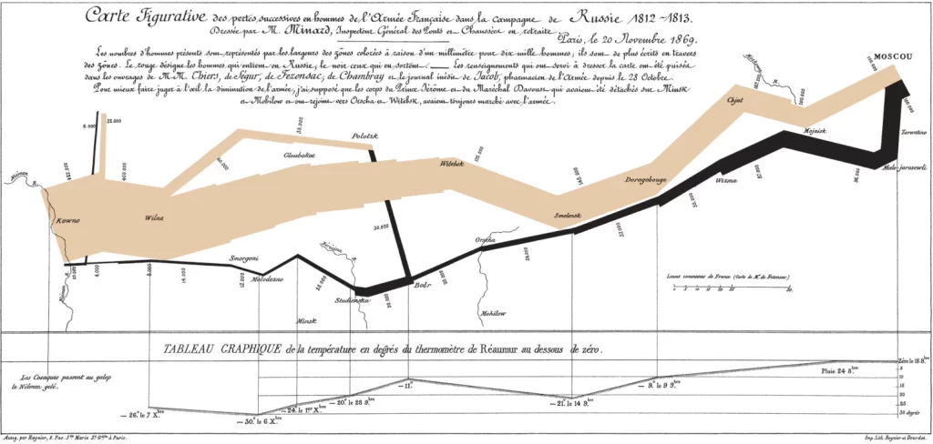
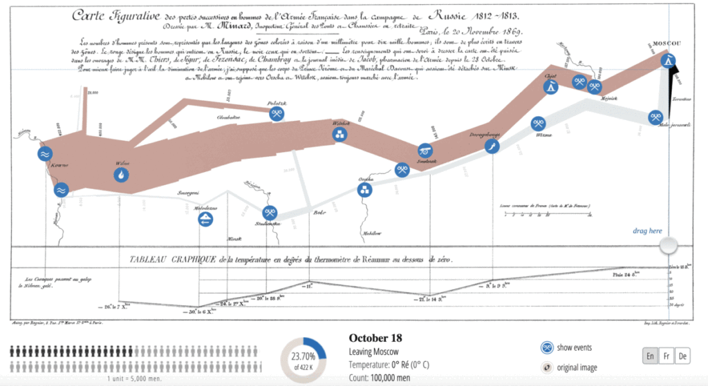
Charles Minard’s Flow Map, created in 1861, has long been regarded as one of the
The Minard Map Charles Minard’s map representing Napoleon’s Russian Campaign is an iconic example of