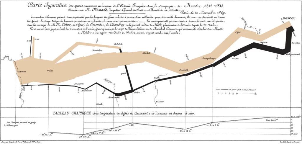
Charles Minard’s Flow Map, created in 1861, has long been regarded as one of the most impactful data visualization projects. His map depicts Napoleon’s Russian Campaign of 1812 through six categories: time, temperature, geography, the army’s movement, and the number of casualties. Minard was able to convey all these elements with minimal writing. Beyond providing a source of data, the map illustrates the story of Napoleon’s Russian Campaign as the lines take the viewers on a journey to Moscow.
How would you improve on it if you were to take a stab?
Although Minard’s map effectively captures various elements of the Campaign, it can be overwhelming at first glance. Without Michael Sandberg’s analysis, it probably would have taken me a considerable amount of time to figure out what each line represents in correlation with the categories. Given the technology we have today, I believe there are a couple improvements that could make the presentation significantly more understandable and emphasize the story Minard is trying to portray. First, I would create a legend listing each of the six categories; users would have the ability to click on which categories they wanted to display. For example, suppose one wanted to examine the relationship between temperature and the number of casualties. In that case, they could click on those two categories, and the map would display them. This function would allow users to easily understand what the lines represent both in isolation and interdependently. I would also embed illustrations of the Campaign along various points of the graph. This will complement the map by offering users the ability to visualize what happened through the use of pictures.
Data Visualization and Digital Humanities
Something that stood out to me from Lin’s lecture was how information is presented can play a significant role in how we perceive data. Still, the absence of specific data can also skew our overall perception. One of the examples was a graph that showed fewer jobs available for women in 2020. However, in reality, there were more jobs available for white women. In contrast, the number available for Latina and Black women plummeted. The absence of specific data can present a false narrative, as viewers are not given the whole picture. It can be challenging to determine if information is missing when there is no data to account for it in the first place. Therefore, it is important to be intentional about which data is being represented to ensure that viewers are not presented with a false narrative.