This week’s topic of networks/graphs was a nice refresher on a topic that I’ve learned about primarily in my CS classes. And just as it was the first time learning it, I was fascinated at all the cool stuff we could do using graphs; this time, in the context of the digital humanities. I chose to further explore the potential of networks by analyzing the ‘Using Palladio to Visualize Ads’ DH project, created by researchers at Rice University.
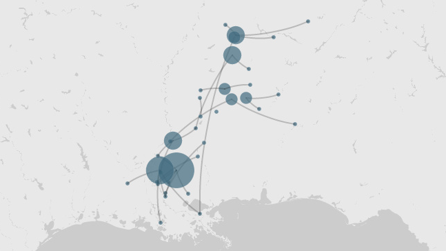
The project told a story of the journeys of runaway slaves by using networks overlayed on a graph of America. I’ve attached an image of one of the example visualizations below. In this case, the nodes represent the start and stop locations of runaway slaves (this information was gathered from written documents such as jailers’ notices) and the edges represent potential paths that they took.

The visualization was created using Palladio, and from how the creators explained it, it seemed like the software was still in the early stages of development. As such, the interactiveness of the visualization was nonexistent. The screenshot you see here contains the same amount of interactiveness as you would see on the website. The creators cited that this was primarily due to Palladio’s lack of support for embedding the visualizations into web pages. This was a bit disappointing as it detracted from my engagement with the site and was definitely a missed opportunity in how much more valuable of a pedagogical tool it could have been.
In order to get the data visualized, the creators had to manually enter data into a spreadsheet. I can imagine this was not the most pleasant user experience. That being said, the project creators were hopeful that later iterations of Palladio would contain more features and believed it to be a great contribution to the digital humanities. At the very least, a lot of interesting insights were extracted through the visualization of this data as a network on a map. Specifically, it was clear that runaway slaves tended to journey south and west more than north.
6 thoughts on “Using Palladio to Visualize Ads”
Comments are closed.
This is an interesting project, but I like how you pointed out what it could’ve improved on. I agree that interactivity is really what makes projects like these thrive, and without it they can feel a bit dull. I think the data is still clear but the lack of interactivity makes it harder to spend time exploring different bits of the data.
I found that the project/network I looked at had similar issues to this network. Both their datasets seemed tedious to create and their interactive nature was non-existent. It definitely is good to see the difference between interactive/non-interactive as it shows how important and engaging projects that are interactive can be.
Yeah, the project I looked at had so much interactivity, this seems unfinished, albeit with potential. How badly are the developers working on fixing the embed process? If it is just the embed functionality not working, the site could be made so much fuller, with links to the reports and such. The lack of interactivity makes it tougher to fully understand what is being visualized on the map.
Even without much interactivity, being able to look at the data on a map as opposed to a generic grey background makes this project a bit more immediately engaging than the project that I wrote about. One thing I’m curious about after looking at this project is the potential for different ways of representing things as nodes, since having higher frequency locations be larger causes some endpoints to be overlapped and potentially covered completely if more data was to be entered.
I agree that the basis of the project is quite interesting. Even with the little interactivity on the map, the visualization aspect allows us to analyze the data better than the raw data on spreadsheet. I like how you mention the points of future expansion of this project. Something that I think would be interesting to look and and I’m not sure if you have access to right now, is when this project was published. Has Palladio has had updates since then? If so, it would be cool to see how this project could look now.
This is a really cool visualization of data that I have never seen mapped before! Although the project wasn’t super interactive, I think the data itself and the specificity is very interesting. I appreciate you pointing out areas that it could have been improved, and I agree that it’s not as robust as it could be, especially on the development side. Inputting row after row of data gets boring quick, and there are much faster alternatives.