Tate Museum Midterm Project
For my project, I did a data visualization of the British Tate museum art and
For my project, I did a data visualization of the British Tate museum art and
The process of georectifying a map really changed my understanding of the difference between creating
The Museum Project has given me a brand new appreciation for curators and their work.
Charles Minard’s map of Napoleon’s losses of troops over time is likely called one of
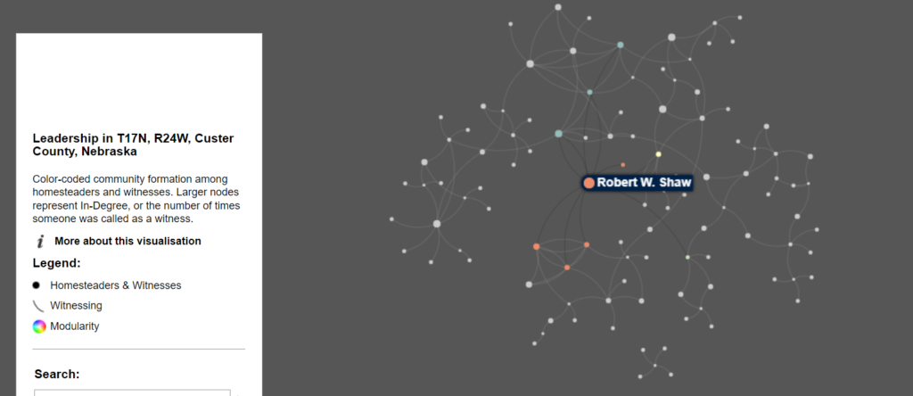
Basics The nodes are different historical figures and the edges are connections between them. Francis
This week’s topic of networks/graphs was a nice refresher on a topic that I’ve learned
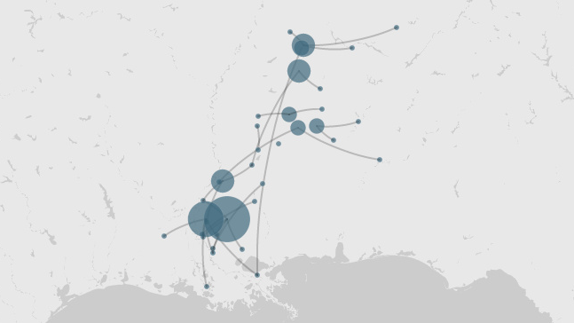
In 2014, a group of scholars at Rice University used the Geographic Data Visualization tool,
In Brian Sarnacki’s presentation of social network data in Grand Rapids, Corruption and Reform, the
This week we were tasked with looking at a network analysis Digital Humanities project. I
The University of Richmond’s Mapping Inequality project shares the data used by the federal government