
My high school statistics teacher always said that “anyone who shows you a graph is lying in one way or another”, and after learning about just a few of the techniques used to visualize data, I understand what he meant much more clearly. Whether out of incompetence, the unavoidable reality that visual representations of data are inherently simplifications of much more complex systems, or just sheer bad intent, no graph, chart, etc. is perfect. It is therefore our responsibility to get as close to perfection as possible or risk “lying” to our audience through bad figures. This is especially relevant in the digital humanities, where much of the work done is based around increasing accessibility of information.
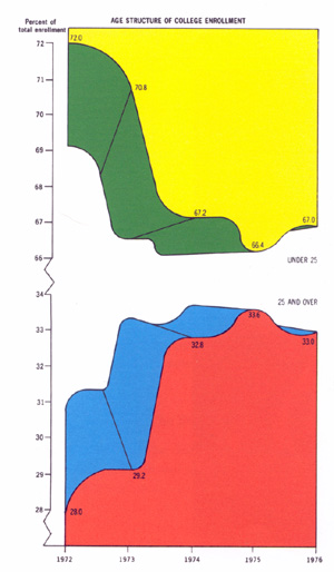
Looking at the posted example under “Keeping it Honest: How Not to Lie with Pictures” taught me a number of important lessons about data presentation. First, a colorful, somewhat stylized graph is generally preferable to readers over a dull one, but stylistic choices should always be examined from the perspective of someone completely separated from the project. While the use of red, green, blue, yellow, and white along with a 3D effect may have made the graph more interesting to the people who made it, it looks ridiculous and confusing to someone who was not involved in those creative decisions. After the confusion this graph caused me, I will not be prioritizing style and flashiness over conciseness and clarity any time soon. Second, a graph should use the least possible ink in order to convey the most information it can. The example graph is twice as tall as it should be because, for some reason, it includes two lines that say the exact same thing. There is absolutely no reason to plot out the percent of college enrollment that is under 25 and the percent that is over 25, because these represent the same data. In this instance, what was likely an attempt to prove a point more clearly than was necessary did nothing but muddy the waters. Finally, axes should not be altered twice in one graph. As with the previous two choices, it is more confusing than helpful.
6 thoughts on “Data Visualization Dos and Don’ts”
Comments are closed.
I really liked the points you made about lying with graphs. I think it’s really interesting to think about how we as graph and map makers can try to portray our data in the most “not lying” ways. I wonder if there are any times where it is ethical to lie with data, or if we should ALWAYS attempt to not do so. I can think of times where I might do that, but none of them seem very ethical.
I totally agree that data visualisation is not always what it seems, whether that’s intentional or not. I feel like through Lin’s talk, this course, and other discourse on this issue, I am wondering how to best respond and make graphs as objective as possible. Or is that not the point of data visualisation? It’s definitely a complicated issue.
I like what you noted about prioritizing the communicative value of the graph rather than the artistic value. As new technologies and techniques emerge for creating cool data visualizations, it can be easy to overdo things when a simple bar plot will suffice. In this post, you point out lying via axes labels and and simply dishonest data points as a means of lying, but I’m also interested in how one might use animation to lie (animation was something I wrote about this week).
That is a very important (and funny) point your teacher made about lying with graphs. As you mention, it is quite easy to do depending on how you choose to portray the data. Like you mention with the missteps of graphs in your post, it matters what you decide to include in the graphic. It was like the example Lin talked about in the news graph and axis label painting a way different picture of change than it was. Something interesting you talk about in your second graph is what data is included and not to include both the over and under 25 aged college enrollments because that is repetitive. I think often this converse is forgotten with data because we do focus and what is not included but not as much what is and shouldn’t be.
The idea that all graphs lie in one way or another is interesting. Certainly, a graph can be thought of as a model of the actual situation, and we can all agree that models are a simplified version of reality. However, if we imagine for instance a bar chart for instance, do you still think that the graph is lying to us? What if it accurately shows the frequency of each of the variables?
Good points about what needs to be shown in graphs and what should be omitted! I’m not sure I would really consider a bad graph to be lying, but I definitely understand what you mean. I think that all graphs are telling the truth, some of them just have really niche data and the full context of the data should always be explained.