Minard’s map:
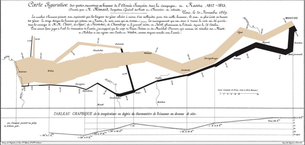
Minard’s map tells the story of Napoleon’s Russian campaign of 1812 and is one of the best statistical graphs I have ever laid my eyes on, living up to all its hype. Before reading it I didn’t know about the war. Now, I have a good idea of how it unfolded. I know the routes the soldiers took, how many managed to get to Moscow, and the casualties along the way. I can also see the deadly path back to France and the toll the low temperature took on the soldiers. As Minard managed to pack all this complex information in a very clear and concise way I believe his map is outstanding.
His success was dependent on many visual cues. The lines, for example, are proportional to the number of living soldiers at any given time. However, to make it more clear, the author also added figures stating the exact numbers of living troops. The map also uses contrast to convey a point, the thin black line going back clearly states the anti-war position of the author. The temperature is directly connected to points in the black line, which makes it easy for the reader to infer the relationship between the cold and soldier deaths. The geographic locations were also indicated on the map, which gives a good historical overview of the campaign. All of these make the graph very intuitive, easy to understand and informative, even for people unfamiliar with the subject. Which makes the graph very successful.
Lin’s Lecture:
One of the main takeaways for me is that you first need to explore your dataset before creating a chart to display to other people. While doing research, many authors start by trying to prove a point. If they do not explore the dataset before plotting their chart all they will do is use it to prove they are correct, missing many interesting be correlations and not formulating other interesting research questions they can infer based on the dataset. Those new questions can be addressed in future papers and research. I feel this is particularly useful in digital humanities as data is qualitative rather than quantitative. Finding correlations between answers given by people to other variables like age or major might give interesting insights on the thoughts and behaviors of certain groups of people.
2 thoughts on “Data visualization”
Comments are closed.
Your point about how much Minard’s map taught you about the event it describes is very interesting, and is something I hadn’t thought one easy-to-read figure capable of before this week. The idea that, through much work and smart use of space, data visualization can be used to tell an entire story in a single figure rather than being a small part of one is fascinating to me, and something I will keep in mind when designing visual aids in the future.
I agree with your points that this is a great visual interpretation of the data, and the hype is understandable, but it is still a reasonably confusing graphic. The information provided has no apparent order, and I believe that a good graph can be understood the first time one looks at it. I’ll use the lines diverging from Polotsk as an example: when did the troops diverge; was it a battle or did they return to Polotsk even after it got cold again? Nevertheless, this is a revolutionary graph. The best? Probably not.