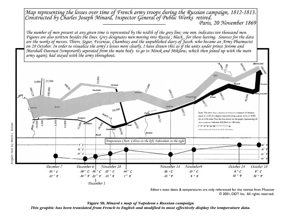
I think that this is a pretty impressive data visualization, partially because there’s so much data on it. Despite its small size, the visualization offers lots of different types of data, which are geography, time, temperature, course/direction of the French army’s movement, and remaining troops. Obviously, this is important information for French soldiers and military officials to know and track, and Minard has done a good job of capturing it in a succinct and readable way. Another reason I believe it to be impressive is how early this was created. While I know the recording of data was common during that era, it was probably uncommon to see summaries and visualizations of this data. This chart was probably the first of its time.
Minard does a good job of using spatial area and placement to denote the important parts of the visualization. It makes sense that the map, seemingly the most important part, takes up the biggest area on the visualization. Additionally, I think the area of the line/ the color contrast dramatically shows how many troops were lost during the battle. It’s really cool how Minard connects geographical areas to their temperatures, as many of the troops likely lost their lives because of the drastic decrease in temperature. If I were to change this visualization, I might not have made the label at the top so big. I think the actual visualization can take up the most amount of space, and the disclaimer/note could be made much smaller.
Lin went over a lot of details related to data visualization, many of which are portrayed on Minard’s graph. Firstly, she talked a bit about color contrast, and how that can be used to differentiate data and words when things need to be separate. In her lecture, she talked about keeping where a person might look in mind whenever making a data visualization, as including extraneous/confusing information might make it less effective. Additionally, area and placement are important to making quality visualizations. The parts that are more important should take up more area and be placed more centrally/where the eye will look first. I think this was stuff that I knew, I just hadn’t put into words yet, so it really helped to have Lin explain these concepts concretely. I think a big part of these digital humanities projects are data visualizations; data is a huge part of the digital world nowadays and there will be an increasing need for us to be able to display it in an easy-to-understand format.
1 thought on “Data Visualization Reflection”
Comments are closed.
I am also quite impressed with this “map”, especially how it is an early portrayal of data visualization (as you stated above). This is maybe unrelated to how Minard portrays data specifically, but it is interesting to think about how, how we visualize data, has evolved over time. This was an early example, but we still use some of the principles in our visualization now. But not all of them. I wonder which ones “died out” that are effective and which ones aren’t that we maybe still use.