Over the course of this term, I’ve come to respect and develop an incredibly deep interest in data visualization. Of course, this can be partly attributed to what we’ve been learning in this class. Beyond that, however, my comps project for the CS major is also largely a data visualization project. Prior to this year, I didn’t really bother thinking that much about data visualization, and thought it to be a rather trivial topic. This term, I’ve come to see that it is a field rich in research and where the questions tackled are anything but trivial. Lin’s lecture on data visualization has reinforced this.
The data visualization I was most intrigued by this past week was Isao Hashimoto’s “2025”. I was a bit surprised by how captivating the visualization was. Specifically, I’m surprised that I didn’t opt to watch the visualization in 1.5x speed or something even though it was a 14-ish minute long.
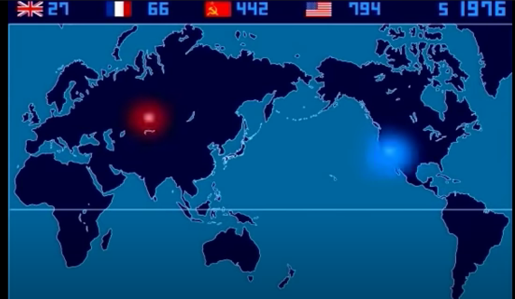
The visualization provided an animated visualization of every nuclear explosion that has occurred since 1945. The animation in this case provides the so-called “4th dimension” of data visualization. While the “4th dimension” was a nice cherry on top for the visualization, I actually think that many other components aside from the animation made this visualization engaging and informative. One such aspect is the placement of the data points on a world map. Another such aspect is the audio attached to the visualization. Every bomb could be heard and every nation was represented with a different note. It added a sort of elegance to the piece. That being said, I am questioning whether adding such artistic touches to a visualization depicting a heavy topic such as nuclear explosions is appropriate.
The above paragraph hints a little bit about the drawbacks I find in visualizing data in “4D”. More specifically, it’s without a doubt an incredibly powerful tool for data visualizations. With that said, with more tools to use, people need to be careful on how they utilize them with particularly emphasis on not overutilizing them. It’s something I’m wary of as it’s a trope that’s common in web development as well. With so many competing technologies emerging everyday and so many options for front-end development (React, Vue, etc.), web developers run the risk of choosing the wrong tool for the job. A similar story stands for using animation in data visualization. While it is a nice asset for a data visualization toolset, there is a time and place for everything.
4 thoughts on “Week 4: Reflective Blog Post”
Comments are closed.
I agree with your suggestion that while adding an artistic touch to data visualization can be interesting, it shouldn’t be overdone, and had similar thoughts regarding some of the Mona Chalabi figures we saw during Lin Winton’s talk. They were more eye-catching and visually compelling than a standard bar graph, but some required interpretation through an artistic lens that made them very confusing taken out of context, which is less of a problem for more standard data visualizations. To quote a great thinker of our time, “while it is a nice asset for a data visualization toolset, there is a time and place for everything.”
I like how you praise the use of animation in data visualization and later question whether it is actually a good thing to do. I agree with your opinion that when there are many tools for doing a particular job, people might not be able to properly choose which one to use. However, I personally think that using “4th dimension” and adding many artistic elements to show nuclear explosions might actually be appropriate as it serves to better captivate the reader’s attention and puts them in a sort of immersive environment.
I think it is cool that you have grown your appreciation for data visualization over the term. Do you think anything from this class will help you on your comps?
I ended up watching the video in 2x speed and found that the explosions started sounding like a song once they started increasing in frequency. In 2x speed the explosions eventually became to frequent to follow, but in my opinion that added to the experience.
The integration with your computer science major seems really cool. Your note on overusing data visualization also resonates with me, as in my opinion, there is such thing as overdoing it. I also agree that developers need to find the right tools for the job, and that watching the video in a faster speed may reveal other correlations, in this case pitch.