What are some things to keep in mind or to avoid as you consider visualizing humanities data?
I think the most important thing to keep in mind when visualizing humanities data is that presentation is the most important piece of a successful project involving data. Your data doesn’t matter if your presentation sucks. The point of gathering data is to draw conclusions from it, so focusing on presenting your data in a way that makes it easy for the audience to draw conclusions should be a priority for any project.
Although presentation is key it is also important to avoid swamping your viewer with too many charts. There are so many options when it comes to charting and sometimes it pays to keep it simple. Yes, a candlestick chart looks fancy and is effective at presenting certain types of data but is it really necessary when you already have 4 other charts for your viewer?
Reflection on the 4th Dimension
“2053” was a mindblowing video. It places every single nuclear explosion until 1998 on a world map. At first, I was bored because the video was very slow but as I kept watching I realized that starting the video slowly made the last 2/3’s of the video more impactful. Another reason the presentation was effective was the sound design. At some points in the video, there were so many blasts going off that it sounded like music. This video is effective because it places all the explosions on the same playing field. The bombs used in war get the same noise and animation as all the test bombs. Presenting the data on a level playing field makes the viewer feel like every explosion is as impactful as the “popular” explosions which adds significance and consequence to every one of the 2,053 explosions in the video.
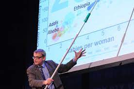
Hans’s presentation might be the coolest TED Talk I’ve ever watched. I remember watching a similar one in my A&I class last Fall. I love how Hans manages to sound like he is putting together this presentation on the fly, even though it is clear that a lot of preparation was put into the talk. I think the most beneficial part of presenting data in this manner is the increased audience participation. I found myself unable to look away from the screen and based on the audience’s reactions during the talk I can infer that most of the audience was engaged with the talk. Furthermore, Presenting the data on a timescale allows the viewer to gain context that they would not normally have considered.
One drawback of the way Hans presented his data is that at times it felt like too much data was being shown. When you have 200+ countries on one chart it is necessary to focus on one country, but in doing so it starts to feel like you’re missing out on the rest of the graph.