With space for much potential in data visualization, there is also the risk in overwhelming viewers or rendering one’s work ineffective. Part of the difficulty is figuring out how to represent quantitative and qualitative data on one display. At the same time, there’s the expectation of delivering a particular narrative as well. Without this, data visualization would be rather unengaging and prevent viewers from recognizing the humanistic aspects attached to the data at hand.
Font Selection in DH
Prioritizing how viewer’s may perceive different components in data visualization is vital to creating a useful representation. For example, font selection can determine how seriously certain text is taken. The inclusion of serifs plays a large role in this aspect, and without them, text comes across in a more approachable manner. It’s important to note that neither of these choices are ‘right’ or ‘wrong’, but making them deliberately allows for scholars to have another tool to deliver their message.
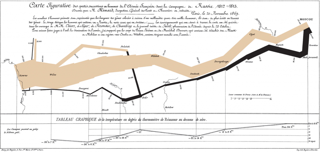
Accessibility in The Minard Map
The Minard Map skillfully uses a font that corresponds with its representation of a historical war, but makes it difficult for users to read the smaller print. This detail may make it difficult for most people to understand the map, but it also alludes to the factor of accessibility. Those with conditions such as dyslexia may find it particularly difficult to read fonts outside the standard ones we see day to day.
Nevertheless, this work has other key features that contribute to its efficacy. Specifically, the different colored bands stand out the most. At first glance, they entice viewers to want to know more about what the graph represents. It elicits questions such as “What do the colors indicate?”, “What does the shape refer to?’, and more. This use of color and shape helps draw attention to the geographical information associated with this data and creates a connection, but also a contrast, between the large and small armies.
Overall, there are many factors such as shape, color, perspective, to consider when visualizing data, and in doing so, scholars can better interpret data for others to understand.
1 thought on “Data Visualization: Stylistic Choices”
Comments are closed.
I like your arguments about the fact that the font in the Minard Map adds to the difficulty in understanding. This is something I was not able to notice while looking at the graph since I did not understand the language. Indeed, the font choice (together with the choice of font size) added a historical sense to the map, however it might not be the most appropriate choice on a map that was meant to be informative.