I found Lin’s presentation in class regarding data visualization really interesting as well as topical with the material in a data science course I am also taking this term. I have always found the principles of UX/UI super fascinating and intuitive from a computer science perspective but it was interesting to see how those can be transferred into data visualization. There is definitely a longer decision process in what data gets displayed and how it gets displayed than I had realized. This is important for DH projects to consider how to approach a data set and what story we want to tell with it.
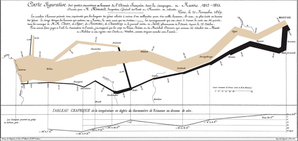
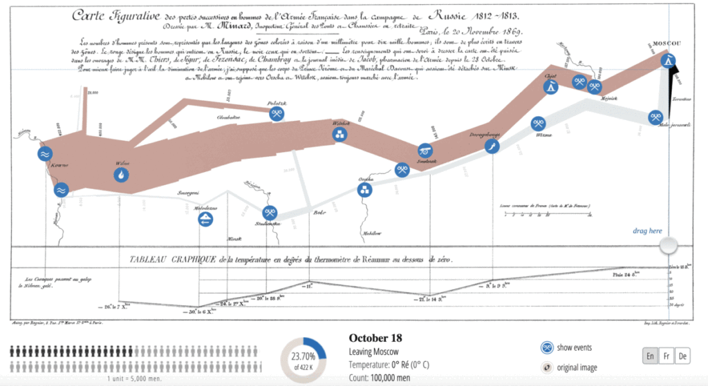
Regarding the “best statistical graphic ever drawn” (Edward Tufte, The Visual Display of Quantitative Information (1983)), Minard’s Map, I would say it is a good display of information, not the best. The issue with the depiction is that it is not clear upon first glance, or even second, what the graphic is trying to display. It requires additionally reading about the variables that the graph wants to show and how they are represented. My gripe with the graphic partially comes from my personal UI beliefs of making information easy to consume immediately. That means the use of color or other forms of contrast in the graphic or clear labels of the numbers and events.

To its credit, given the amount of variables included in the graphic, Minard’s Map does do a good job incorporating all of them in a cohesive way. Compared to other static versions of the map, the original map is the most concise. The temperature with the locations and scaling of army size make the original version unique and are stand out features for the praise of the map. The custom coded interactive map by Norbert Landsteiner of Minard’s Map was a great way to elevate the original graphic. This version allows for the key events in the trail to pop (in a different color) that the user can clearly point out. The slider of dates lets the user follow along the path of the army with the size of the army shown in a smaller graphic adjacent to bigger map. This gives a better understanding of army size whereas the thickness of the line is useful for comparison to the size at different points. I would take this one step further and add color to the temperature variable to tell the full story of how cold some of the days got. Overall, Minard’s Map is an important display of statistically story telling but not the best statistical graphic to exist and has many aspects it can improve upon.
3 thoughts on “Is Minard’s Map the Best Statistical Graphic?”
Comments are closed.
I agree with you that this map is commendable even if a little bit cluttered because, after all, it integrates many variables, each of them informative. I think it’s even more amazing that this was a visualization created in 1869. It makes you wonder what the status of data visualization research was like during that time. Going even further, I wonder how far back you can trace the study of data visualizations.
I completely agree with your take on Minard’s map! Yes, it may include information at never-before-seen levels, but a first-time viewer will have a hard time comprehending what the graph is trying to say. While I would not necessarily call the graph cluttered, there is so much data that it is hard to know even where to begin. The interactive version, however, may be one of the best visual information displays ever.
I could not agree with you more on the map being hard to read. I remember looking at this map in my A&I course and taking 10 minutes for my instructor to explain it to the class. However, once a person gets what the graph represents, it is one of the best ways to represent this data. There seems to be an interesting tradeoff between the readability of a graph and the complexity of information the graph can show.