Data Visualization: Stylistic Choices
With space for much potential in data visualization, there is also the risk in overwhelming viewers
With space for much potential in data visualization, there is also the risk in overwhelming viewers
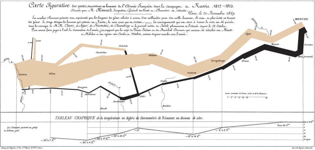
Charles Minard’s Flow Map, created in 1861, has long been regarded as one of the
This week our class focused on the presentation of data, specifically in graphical form. At
Perceptual Biases in Data Visualization There are several websites discussing factors that may cause people to perceive
The Minard Map: Why is it considered such a landmark visualization? My first look at
The Minard Map Charles Minard’s map representing Napoleon’s Russian Campaign is an iconic example of