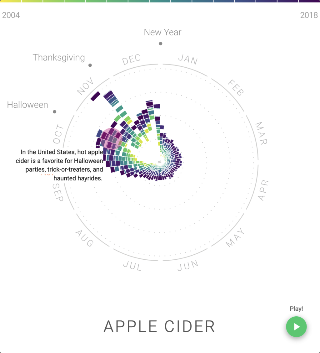
How do our food interests change seasonally? This is the question that Google’s research project The Rhythm of Food seeks to answer. The Rhythm of Food uses Google trends data to identify and visualize changes in a regions food search habits. Looking at relative searches for foods chronological can provide unique insights into the cultural and seasonal use of food.
So how is this data accumulated?
while the records and code google uses to collect search results is proprietary (it isn’t open source), the processed results are publicly available at the Google Trends website. unfortunately the tallies of search results aren’t provided, only a score showing change in relative searches.
We don’t know how google directly collects this information, but we can theorize by looking at the data they provide. From the google trends website .csv files (tabulated data) can be downloaded that describes search interest in a topic by date and geographic region. Google presumably has a way of identifying the user’s region of access (probably through IP address).

How is this data processed?
The tallies for total searches aren’t publicly released but the “trend scores” are. So what is a trend score? A trend score shows the relative interest in a search result by scoring the total number of searches between 0-100. A score of 100 indicates that during that time frame searches were at an all-time high. a lower score is directly proportional to the all time high (a 50 is 50% of the all time high). Theses scores are assigned regionally. So a day that scores 100 in the US might score lower when compared to anther country.
Finally, how is the data visualized?
To understand how the collected data is visualized, let’s look a diagram describing the number of searches for apples in the United States.
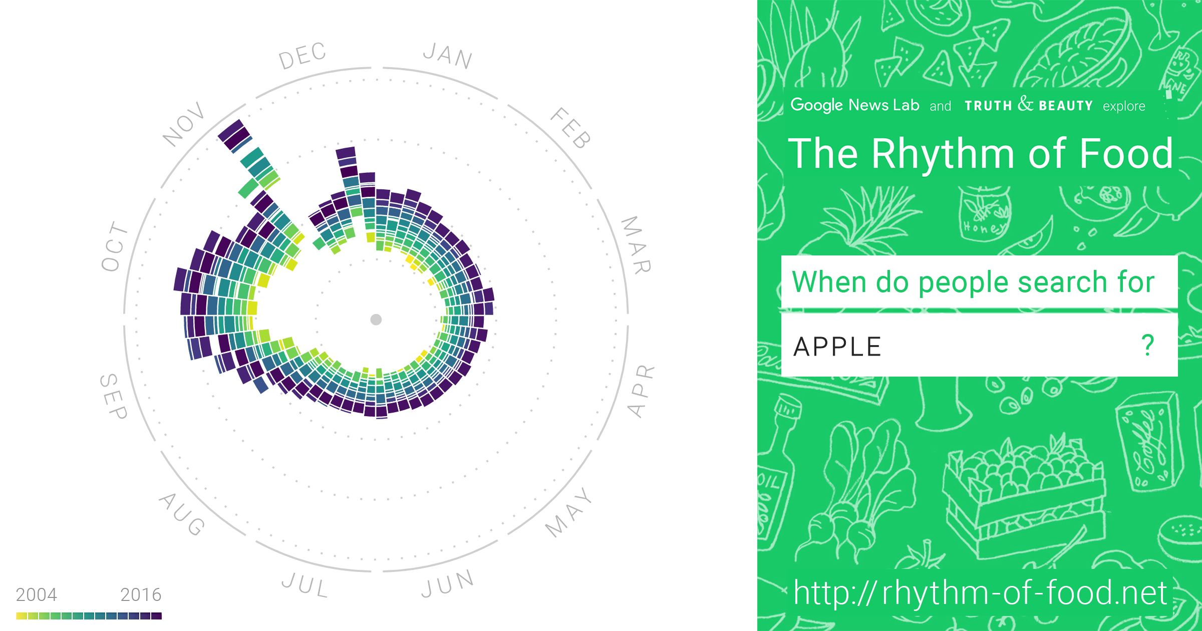
Data points are first categorized by date. Month and day place the data point on the clock and the color of the data point is determined by the year staring in from 2004 (light yellow) to 2018 (dark purple). Then depending on the search score the data points are placed further from the center of the clock if they have a high search score. A short animation can be played placing the data points in chronological order.
Looking at the graphic, a spike in search score can be seen in late November. A good explanation for this outlier is that thanksgiving also occurs in late November.
After looking through this project, I really want to know some of the tallies for search results. While looking at the search scores is informative, it doesn’t communicate the scale of these changes. Between September 14th and September 15th (national double cheeseburger day) does the number of searches for cheeseburger change from 39,000 to 100,000 , or from 3,900,000 to 10,000,000? Unfortunately google will probably never answer that question. Regardless I highly recommend taking a look at The Rhythm of Food.