The Minard Map is a landmark visualization. It’s unbelievable that Charles drew so much information in just one map. The idea of using the width of the path to represent the size of the force is genius. The visualized size of the army exceeds plain numbers in respect of perceptual intuition. Also, it improves the map’s clarity. Also, the temperature of the war provides essential background information for the audience. I would probably add to the map the dynamics of the Russian army to see the interaction between the two sides. Another thing I would add is the topography. I think topography is essential for analyzing wars and battles because using topography well can sometimes change the war situation.
Reflects on the information from Lin’s lecture and how it relates to DH
I am tired of seeing how data has been manipulated for subjective purposes. Lin used an employment example to demonstrate how data can be misleading without careful analysis. That example reminds me of another example of how the Chinese eating meat affects the planet. Time published an article on How China Could Change the World by Taking Meat Off the Menu, claiming that “Today, China consumes 28% of the world’s meat.” The data shows China is a significant threat to global climate change by consuming meat and meat product. But when investigating meat consumption per capita data, China is not even in the top 20.
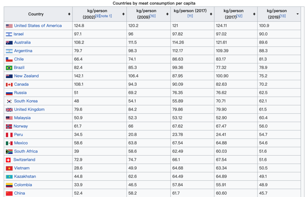
Additionally, when considering the diet culture behind the data, the Chinese waste a minimal amount of meat because of the custom for animal organ consumption developed in the famine period throughout history. Chinese eat organs that most western countries throw into the trash bin. Only when we chew over the information behind the data can we see the reality, and only when we seriously treat environmental problems without blaming each other and hiding problems can we save the Earth and ourselves.
1 thought on “Behind the Data”
Comments are closed.
Thank you for sharing this example. It highlights how when data is handpicked to be evidence for a specific argument you run the danger of loosing important context. In this case the lack of context means that this article contributes to an overwhelming amount of literature and policies originating from the western world that place blame on the global south for practices that the west either currently participates in or have done in the past. That one piece of data – the 28% of the worlds meat is consumed in China – could have been placed in context by a graphic containing data visualization. A simple, clean well labeled bar graph could have shown where China lies within the global context. Although that might not have supported the rest of their argument 🙂