Mapping Inequality: Redlining in New Deal America
Breaking this project down…
Project goal and argument: The goal of this project is to make the city maps created by the Home Owners Loan Corporation easily accessible. As a result they are highlighting the impact they had on the way that America’s cities and the people that live in them today are situated and the practices of institutional racism that are inherent in America’s governance.
Sources: This project uses the Home Owners Loan Corporation (HOLC) security maps and assessments of neighborhoods and cities around the United States. The security maps depict the rating system used by the HOLC in their real-estate appraisals which contributed to discriminatory federal housing policy blocking African Americans from accessing real estate. The HOLC maps split cities into graded color coded areas (see grades and corresponding color below). The goal of these grades were to help banks and other mortgage lenders decide where it was safe to invest.
- A “Best” – green/light blue on some maps
- B “Still Desirable” – Blue
- C “Definitely Declining” – Yellow
- D “Hazardous” – Red
The red “Hazardous” zones as defined by the HOLC maps is where the term “redlining” came from. The image below shows how these zones are shown on the maps for St. Paul and Minneapolis.

Processes: Mapping Inequality uses several different levels of services to process the data from the HOLC documents and present an interactive view of redlining in the United States.
- Digitizing the original maps and documents.
- Scanning and transcribing: For each map there is a scan, georectified image, a spatial file (either Shapefile and a GeoJSON). In addition to the map there are scans of the descriptions of each area. These descriptions are also transcribed and available as text on the web interface. This was done by a large number of people on various teams. Seems like they also might have used a crowdsourcing program (NYPL Scribe) for the transcribing.
- Georeferencing maps: Taking the scanned maps and plotting them onto their online mapping program so they are geographically accurate.
- Creating the map. This involved creating polygons for storing the geographical and historical map data.
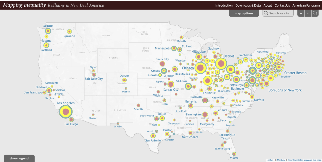
- Proportions of graded areas in cities: This is shown in the colored circles on the overview map. These circles show the how much of the city is in each grade (See image below). These proportions are displayed further when you select a specific city.
- Demographic data: There is additional demographic data for each city the user selects.
Presentation: The display is an interactive map that you can either explore by moving and zooming on your own or by searching for a particular city. They also provide several different map interface options: full map (shows you the entire scanned HOLC map when zoomed into a city), only the graded areas or only the polygons (the graded areas mapped onto the digital map without any scanned images from the original map).
Reflections…
Prior to this exercise I was already interested in mapping and the different ways it can be used to tell stories and looking more closely at this project made me even more interested. It also highlighted how many steps and levels there are to a project of this scale. There are so many people involved and so much time went into creating the high levels of detail that this project entails.
I have many questions about how they went about creating the map. These questions include: what mapping software or code did they use? And how did they georeference the scanned maps onto whatever real time map they used?
Citation: Robert K. Nelson, LaDale Winling, Richard Marciano, Nathan Connolly, et al., “Mapping Inequality,” American Panorama, ed. Robert K. Nelson and Edward L. Ayers, accessed September 21, 2022, https://dsl.richmond.edu/panorama/redlining/[YOUR VIEW].
2 thoughts on “Week Two Reflection Post: Mapping Inequality”
Comments are closed.
I am a little confused on how the project connects the HOLC ratings to the demographics to see the disparities. I can see the ratings on the map and the demographics on the left, but where do they intersect? It is a really cool dataset and using this to change the housing market for the better is absolutely a must.
This is pretty interesting to see the variety of opinions in different areas! I’m from Oakland, which is one of the cities on this map that are considered to be pretty “Hazardous,” and I can understand why the mixed opinions arose from there. However, not all of the cities ratings make sense to me! Like, why would salt lake city be considered more hazardous than LA? My brother’s friend’s roommate got stabbed in LA while walking around USC just a few months ago. It makes me wonder if this data is biased, and if so, how? For example, the high mormon population in salt like city might make it more “hazardous” to a Queer person, but safer for cis/hets. In fact, most cities will be more and less friendly to different demographics. It would be great to see a map that accounts for factors like this, or just includes more detail. Still super interesting though!