I analyzed the Banks and Bankers data visualization from Brian Sarnacki’s Corruption and Reform project. The overall project contained many similar visualizations of social/business data, but I focused on Banks and Bankers because it was slightly easier to see everything on one screen than the others. In this diagram, the nodes are either financial institutions or people, and the edges indicate board of directors membership to a certain bank in the year 1902.
The project allows users to enhance the visibility of groups based on number of members and search for specific names to view their connections, as well as zoom in/out and pan across the chart to view things more closely. Hovering the cursor over a node also highlights the items directly connected to it. Having access to these interactions made the project more interesting to me by making it easier to look closely at the information it had to offer. Had the project been a static chart with a key on the side, I most likely would have looked it over for a few seconds before picking something else to write this reflection on.
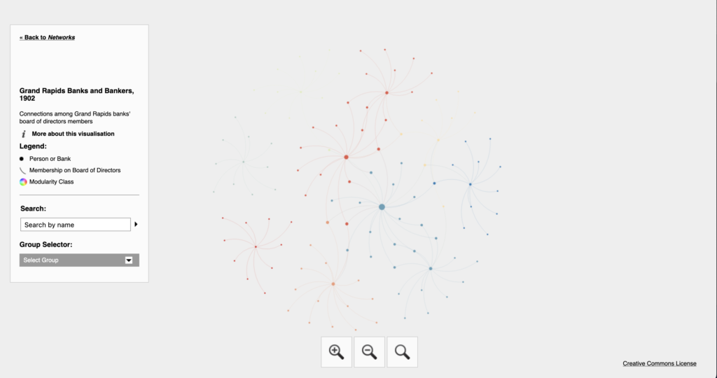
Despite being well made overall, there are several issues with the visualization that makes this project more difficult to engage with than some of the others on the list. The nodes are all very small and spread out, and the lines between them are very thin. This makes zooming in important to enhance visual clarity, but also results in much of the information being cut off due to how far apart everything is. This annoyance is common throughout Sarnacki’s project. It was one of the primary reasons I focused on the Banks and Bankers plot (it had relatively few points) and is something I will keep in mind when designing visuals in the future.
The creator of this project lists their source of information as “R. L. Polk & Co.’s Grand Rapids city directory,” which was published in 1902. This document was accessed through Google Books. Gephi is credited as the program used for the majority of the visualization work for the project, but there was also spatial work done due to the fact that much of the city of Grand Rapids’ infrastructure has changed in the last century. This required the creator to “modernize” many addresses, for which Google Maps was used.
2 thoughts on “Reflective Blog Post #3”
Comments are closed.
I like how you mention that interactivity on this visualization grabs your attention and helps you stay on the site longer than a static image. I felt a similar way when choosing the network I wanted to analyze. I feel that is something important to keep in mind when working on our own projects in the future. Despite the interactivity, I like that you mention what can be improved on the project. The thin edges and small nodes are definitely annoying as you mention and I feel might also be an accessibility issue for some looking at this project which is something else to keep note of for future projects.
I highly appreciated that you gave a balanced description(the good and bad side) of this network although this has not been explicitly mentioned in the assignment. Not only did you just balance your views, but you also gave strong points. I checked that network and saw that indeed it was quite hard to see some of the nodes as they are too small. Though, I think having bolder nodes(rather than faint ones) could do the same job as having larger ones. What do you think?