Data visualization is a key aspect of a project. How a project conveys important information can determine its success in driving home key conclusions or takeaways.
The Minard Map

I found this “landmark visualization” to be highly confusing at first. However, after reading more about it I have found it easier to follow. The simplicity of the visualization without losing information is impressive. It also tells a very interesting story across many different variables, but still in a clear and understandable manner.
Although I do believe this to be a good visualization, I do not think it to be the best ever. I believe that a more modernized style would benefit the graphic. I think this might be the best graphic for this particular story, but in many other fields or projects, there are better ways to convey their information.
Keeping it Honest: How Not to Lie with Pictures
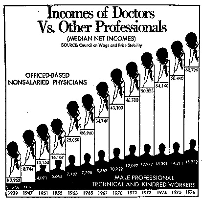
One mistake that I did not think about was adjusting the scale of an axis mid-axis. In this graphic, the horizontal axis displays the time. Each bin towards the end (1976) is a single year, but at the beginning, the bins were over 7 years. This difference provides a visual trend that does not properly correlate with the data. This is something that is just not valid for binned graphics, which is why I did not think it was something people would do.
Animation (unlocking the 4th dimension)

As seen in this video, sequential visualization allows us to display our data as we would expect it (here it is given in coordinates), but also display that data over time. Doing it sequentially like this also allows a more natural feel of the order of occurrence of these events, which is a really important aspect for data such as this.
Reflection
I think it is difficult to make the perfect visualization, but there are a lot of important aspects of a graphic that make it much easier to understand. As Lin said, the smaller details are sometimes (especially in this case) the most important to get right. Providing the reader with an easy and intuitive graphic allows them to focus directly on the relationship/conclusion you are highlighting.