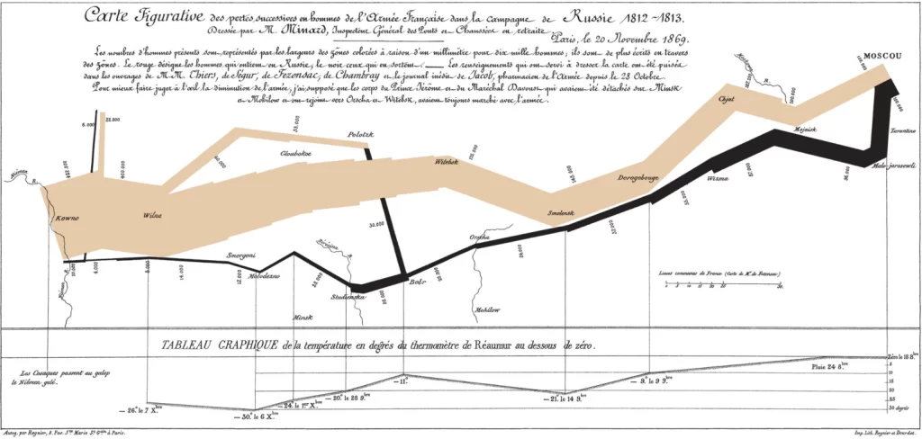
I’ve always known that it’s not a good idea to invade Russia in winter but never exactly how bad of an idea. After looking at The Minard Map I have a much better understanding. The Minard map is a graphic visualization of Napoleon Bonaparte’s advance and retreat from Russia in 1812-1813. When you first look at it you notice the striking tan and black bar that snakes its way across the image. As you look closer you realize that this shows the number of people in Napoleon’s army. What starts as a thick line representing lots of people in a matter of months (as shown on one of the axes) is reduced to a thin line. The map is an excellent way to visualize the disastrous campaign because it shows many different categories of information: geography, army’s direction, number of men in the army, time, and temperature. Today the map is considered one of the best visualizations and a landmark one. As someone who does not have a lot of experience looking at historical visualizations I think the chart does a great job at telling a story. You can see many of the perils faced on the journey to and from Moscow. The more you look at the diagram, the more you learn. For example, crossing the Berezina river on the retreat caused Napoleon’s army’s numbers to go from approximately 11% of initial army size to about 6%.
While not an addition to the diagram as is, I think an interesting related data visualization would be to compare Napoleon’s invasion to the Nazi invasion of Russia in 1941. It would be interesting to see if the same temperature factors or river crossings proved to be divisive moments in 1941 as they were in 1812-1813. Through comparison and visual aids, just by looking at an image one might be able to see how 100 years of technological advancement plays a role in the invasion of Russia.
4 thoughts on “The Minard Map”
Comments are closed.
The story this map tells is really cool as you point out. It highlights not only the number of soldiers and location, but also the time and temperature, which is a key variable in the decline of the soldier numbers. I agree it would be very interesting to compare this to the Nazi invasion which was very similar.
I was also impressed by the detail of the map, in that you are able to see specific correlations between temperature/geographical changes and the number of soldiers still alive. I also think it would be interesting to examine how technological advancements have hindered the number of casualties due to natural causes. It would also be interesting to see how the development of weapons has played a role in the rate of soldiers’ death.
You gave a very detailed description of the graph. The map appeared initially confusing to me, but I was able to follow your words to figure out the main information and the variables. I like your idea of visualizing the Nazi invasion of Russia in 1941 and comparing the technological advancement. It might also be helpful to make the map interactive so people can zoom in to see details of each batter.
Thank you for introducing the idea of comparing the Nazi invasion and the Napoleon invasion of Russia. If Minard had been born several decades later and lived through World War 2, he would definitely draw a comparison map. Another thing I would add to the maps is the Russian army data since the cold weather affects everyone.