Flourish is a freemium online network analysis and visualization tool. This tool is great for showing relationships between individual entities if it wasn’t obvious from the description. Like many other network visualization tools, Flourish’s displays are based on imported spreadsheets and CSVs. However, what sets Flourish apart from other tools is its minimalist user interface and ability to create “stories.” The intuitive nature of Flourish and its many ways of representing data make this one of the best analysis tools I have used in the course thus far, and this tutorial is going to (I think) prove this.
The first thing that Flourish asks the user to do is sign in. This is a cloud-based program where all visualizations are available through an internet connection. Once the user signs in, they can see their previous projects or select “New visualisation” to create a new project.

Once the project opens, the first thing to do is click on the “Data” tab under the ribbon. You will then be directed to the “Points” window, which resembles a spreadsheet. The user can either input the data manually or upload any compatible file (CSV, TSV, JSON, etc.) by clicking on the blue “Upload data” button. For the sake of this tutorial, I will use the default data as an example.

The user then has to head to the window on the right to specify which column pertains to what. The I.D. column (A) distinguishes individual nodes, and the group column (B) defines what color the respective nodes are given based on a shared descriptor.
After the I.Ds and extra data are set, the user has to define the connections. They have to click on the “Links” tab to the top right of the spreadsheet.

This page is very similar to the “Points” page. Here, however, the user has to input the previously established I.Ds and their connections in two separate columns. These columns and the value of each link (the thickness of the edges in the visualization) can be specified in the far right window.
And voila! The user can now preview their network by clicking on the “Preview” tab on the top.
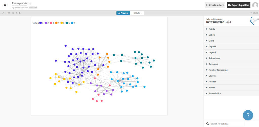
If the user wants to make any aesthetic changes, they have a wide selection of dropdowns on the far right tab where they can change node and edge colors, borders, size, and even animations.
Finally, the user can export this by clicking on the black button in the top right of the screen labeled “Export & publish.”
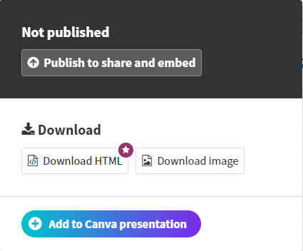
Select the desired export method (note that downloading the HTML is a premium function), publish, and share!
The following links provide a more in-depth overview of this program and a more advanced look at adding custom content to the visualization.
2 thoughts on “Flourish Tutorial”
Comments are closed.
I appreciate reading your tutorial on this tool since you did the majority of the network on this for our group project. It’s nice to see the process, especially some of the challenges that you might’ve had using this tool. In your tutorial I also appreciate how you explain the different terminology.
Florish seems like a great resource for creating networks. It looks really intuitive to use, unlike Gephi, and it offers a lot of the same functionality. I was wondering, once you actually create your network, does Florish have any options to sort the nodes?