Data Visualization Reflection
I think that this is a pretty impressive data visualization, partially because there’s so much
I think that this is a pretty impressive data visualization, partially because there’s so much
Charles Minard’s map of Napoleon’s losses of troops over time is likely called one of
This week’s topic of networks/graphs was a nice refresher on a topic that I’ve learned
The project I chose to inspect was Brian Sarnacki’s Grand Rapids Elite network which aims
The answer is yes, humanities students should learn to code. The most naive argument I
The University of Richmond’s Mapping Inequality project shares the data used by the federal government
Angkor is a city in Cambodia. This digital project is about bringing to life the
The project I was exploring was the Geo News Miner (GNM) site visualizing the references
Intro I explored Rhythm of Food, which aims to explore hidden search patterns in Google
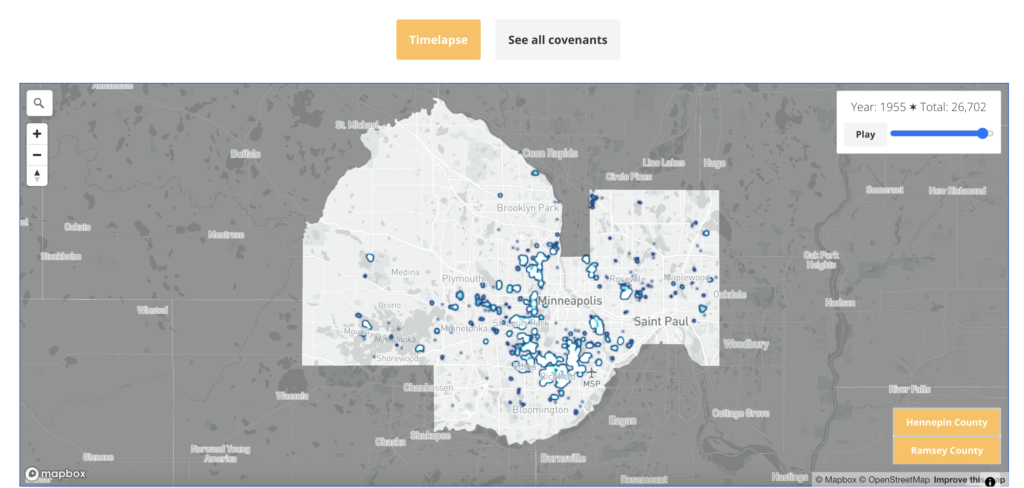
Mapping Prejudice is a project created through the University of Minnesota that aims to expose