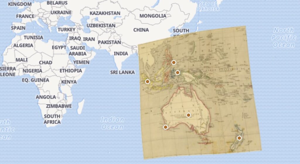
This week, I practiced overlaying an 1841 map of Oceania onto a modern map. I used six control points and focused them around prominent regions such as Australia, New Zealand, and Southeast Asia.
What was the process like?
Georeferencing using the website provided was highly intuitive and made the process engaging. I did, however, neglect the ‘Search Location’ feature, and primarily zoomed in to find control points, but I found that this made the process more “hands on”. In doing so, I was able to interact with both of the maps more, and see how the historical map compared to the base map. The historical map was in French. This wasn’t much of an obstacle, but the text was in a serif font. This has been a common theme I’ve noticed throughout the term, and the font selection made it a bit difficult to read the locations. As for the actual map itself, prominent areas were outlined in color making regions like the Philippines and Indonesia stand out more. This made it easier to find control points, but most maps most likely would not have such a fortunate addition.
What can we takeaway from this method?
While this method was useful for comparing historical and modern maps, there are cases where it may not be appropriate or fairly practical. Initially, I tried looking for a map of choice instead of generating a random one. I checked the ‘Climate’ maps intending to find ones that would allow me to compare how regions have evolved over time. I found an image that was a collection of 13 maps that indicated the ‘monthly mean of sunshine’ in the 90s. Aside from the fact that overlaying 13 maps could be overwhelming for viewers, doing so wouldn’t serve much of a purpose and distract from the sunshine map. It would be more practical for it to stand alone. Despite this, I think climate and environmental changes can still be shown skillfully through this type of georeferencing, but preferably through a topographic base map.
3 thoughts on “Georeferencing 1840’s Oceania”
Comments are closed.
I also did not use the “search location” feature when layering my map. Zooming in definitely allowed me to understand my map in more depth. The actual process of layering the map forced me to examine it more deeply than if I were just a passive observer. I agree with your point that sometimes this method can take away from a map more than if it were to stand alone.
I like what you said about how the overlaying of maps could overcomplicate things unnecessarily. The example you gave about the climate data proving potentially troublesome to place on a map brings up a good point as well. Specifically, if web maps are all the rage in terms of spatial data, I wonder what visualization techniques work best for temporal data.
While some of the maps from David Rumsey’s map collection may benefit from being georeferenced, I agree that some of the maps (like for example monthly mean of sunshine map you encountered) the would be needlessly messy. Some of the maps I georeferenced were cluttered with useless graphics that didn’t meaningfully contribute anything.