Data Visualization Reflection
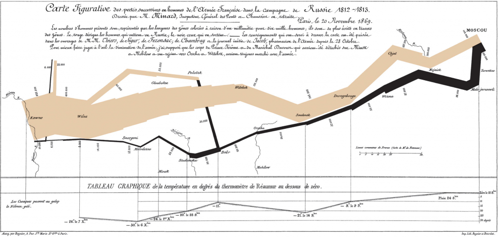
I think that this is a pretty impressive data visualization, partially because there’s so much
I think that this is a pretty impressive data visualization, partially because there’s so much
I think the key take away from Lin’s presentation is that good data visualization should
This week, I looked at the provided “4D” animation formats data may be presented in
Infographics are a powerful source to portray vast chunks of information. Some are accurate while
Minard Map Earlier this term we learned about types of data and the ways it
Charles Minard’s map of Napoleon’s losses of troops over time is likely called one of
The Minard Map is a landmark visualization. It’s unbelievable that Charles drew so much information
I knew that it was important to present data accurately, precisely, and clearly. But I
Data visualization is a key aspect of a project. How a project conveys important information
With space for much potential in data visualization, there is also the risk in overwhelming viewers