Reflection: Data Visualization and Minard’s Flow Map
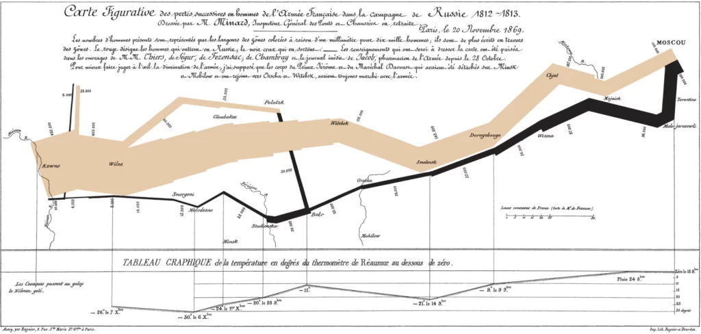
Charles Minard’s Flow Map, created in 1861, has long been regarded as one of the
Charles Minard’s Flow Map, created in 1861, has long been regarded as one of the
This week our class focused on the presentation of data, specifically in graphical form. At
Perceptual Biases in Data Visualization There are several websites discussing factors that may cause people to perceive
The Minard Map Charles Minard’s map representing Napoleon’s Russian Campaign is an iconic example of
Basics The nodes are different historical figures and the edges are connections between them. Francis
Have you ever heard of the game Six Degrees of Kevin Bacon? the challenge of
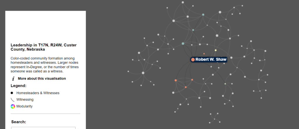
This week we were tasked with looking at a network analysis Digital Humanities project. I
Intro I explored Rhythm of Food, which aims to explore hidden search patterns in Google
“People are actively doing intersectional digital humanities work in all but name in other arenas