Reflecting on Data Visualization
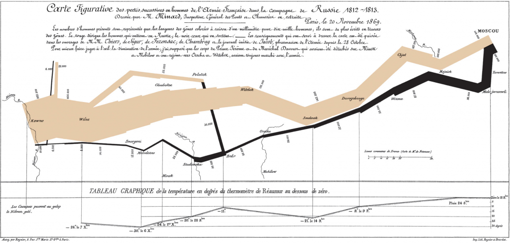
This picture, made by Charles Minard, depicts Napoleon’s campaign to force the Russians back further
This picture, made by Charles Minard, depicts Napoleon’s campaign to force the Russians back further
Minard Map Earlier this term we learned about types of data and the ways it
The Minard Map is a landmark visualization. It’s unbelievable that Charles drew so much information
I knew that it was important to present data accurately, precisely, and clearly. But I
Data visualization is a key aspect of a project. How a project conveys important information
With space for much potential in data visualization, there is also the risk in overwhelming viewers
Charles Minard’s Flow Map, created in 1861, has long been regarded as one of the
Perceptual Biases in Data Visualization There are several websites discussing factors that may cause people to perceive
The Minard Map: Why is it considered such a landmark visualization? My first look at

